Welcome to Tailwind Page
Understanding Tailwind CSS: A Comprehensive Guide
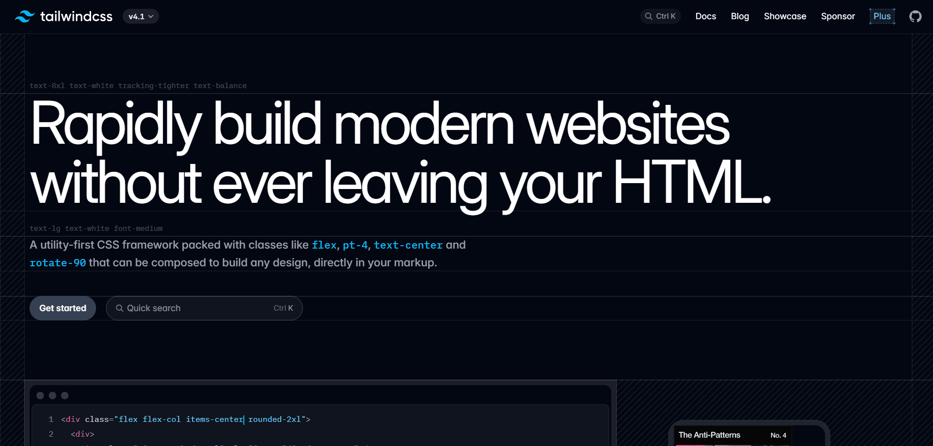
Tailwind CSS has revolutionized the way developers approach styling in modern web development. As a utility-first CSS framework, it provides a fundamentally different methodology compared to traditional CSS frameworks like Bootstrap or Foundation. Rather than relying on pre-built components, Tailwind empowers developers to build custom designs directly in their markup using composable utility classes.
What is Tailwind CSS?
Tailwind CSS is a utility-first CSS framework that allows you to compose complex design tokens into a single, optimized CSS file. It is designed to be easy to use, fast to compile, and easy to understand. The framework operates on the principle that instead of writing custom CSS for every component, you can combine small, single-purpose utility classes to achieve any design you can imagine.
The beauty of Tailwind lies in its flexibility and efficiency. Unlike traditional frameworks that impose design decisions on your project, Tailwind provides low-level utility classes that let you build completely custom designs without ever leaving your HTML. This approach eliminates the need to think up class names, jump between HTML and CSS files, and worry about CSS specificity issues.
Core Utility Classes
Tailwind CSS offers an extensive collection of utility classes covering virtually every CSS property. Let's explore some fundamental categories that every developer should know.
Typography Utilities
Text styling in Tailwind is incredibly straightforward. The framework provides utilities for font size, weight, color, alignment, and more:
text-xsthroughtext-9xlfor font sizes ranging from extra small to extremely largefont-thinthroughfont-blackfor font weightstext-left,text-center,text-right, andtext-justifyfor text alignmentitalicandnot-italicfor font styleuppercase,lowercase, andcapitalizefor text transformationtracking-tighterthroughtracking-widestfor letter spacing
These utilities make it simple to create beautiful typography without writing a single line of custom CSS.
Color Utilities
Tailwind's color system is one of its most powerful features. The framework includes a carefully crafted color palette with multiple shades:
text-{color}-{shade}for text colors (e.g.,text-blue-500,text-red-700)bg-{color}-{shade}for background colorsborder-{color}-{shade}for border colors- Colors include: slate, gray, zinc, neutral, stone, red, orange, amber, yellow, lime, green, emerald, teal, cyan, sky, blue, indigo, violet, purple, fuchsia, pink, and rose
Each color comes with shades from 50 (lightest) to 950 (darkest), giving you precise control over your color choices.
Layout Utilities
Building responsive layouts is effortless with Tailwind's layout utilities:
containerto constrain content widthflexandgridfor flexible and grid layoutsblock,inline-block,inline,hiddenfor display propertiesstatic,fixed,absolute,relative,stickyfor positioningtop-0,right-0,bottom-0,left-0for position valuesz-{value}for z-index control
Flexbox Utilities
Flexbox becomes incredibly intuitive with Tailwind:
flex-row,flex-colfor flex directionflex-wrap,flex-nowrapfor wrapping behavioritems-start,items-center,items-end,items-baseline,items-stretchfor align-itemsjustify-start,justify-center,justify-end,justify-between,justify-aroundfor justify-contentflex-1,flex-auto,flex-initial,flex-nonefor flex sizinggap-{size},gap-x-{size},gap-y-{size}for gaps between flex items
Spacing Utilities
Tailwind uses a consistent spacing scale throughout:
p-{size}for padding on all sidespx-{size},py-{size}for horizontal and vertical paddingpt-{size},pr-{size},pb-{size},pl-{size}for individual sidesm-{size}for margin (follows the same pattern as padding)space-x-{size},space-y-{size}for spacing between child elements
The spacing scale includes: 0, 0.5, 1, 1.5, 2, 2.5, 3, 3.5, 4, 5, 6, 7, 8, 9, 10, 11, 12, 14, 16, 20, 24, 28, 32, 36, 40, 44, 48, 52, 56, 60, 64, 72, 80, and 96 (where 1 = 0.25rem = 4px).
Border Utilities
Creating borders and outlines is simple:
border,border-{width}for border widthborder-{side}for borders on specific sidesrounded-{size}for border radius (rounded-none,rounded-sm,rounded,rounded-md,rounded-lg,rounded-xl,rounded-2xl,rounded-3xl,rounded-full)border-solid,border-dashed,border-dottedfor border styles
Shadow Utilities
Adding depth with shadows:
shadow-sm,shadow,shadow-md,shadow-lg,shadow-xl,shadow-2xlfor box shadowsshadow-innerfor inner shadowsshadow-noneto remove shadows
Responsive Design
One of Tailwind's most powerful features is its mobile-first responsive design system. You can apply different styles at different breakpoints by prefixing utilities with the breakpoint name:
sm:- 640px and abovemd:- 768px and abovelg:- 1024px and abovexl:- 1280px and above2xl:- 1536px and above
Example: <div class="text-sm md:text-base lg:text-lg"> creates text that grows larger on bigger screens.
State Variants
Tailwind includes variants for handling interactive states:
hover:for hover statesfocus:for focus statesactive:for active statesdisabled:for disabled elementsvisited:for visited linksfirst:,last:,odd:,even:for positional states
Example: <button class="bg-blue-500 hover:bg-blue-700"> creates a button that darkens on hover.
Dark Mode Support
Tailwind makes dark mode implementation straightforward with the dark: variant:
<div class="bg-white dark:bg-gray-800 text-black dark:text-white">
  This element adapts to dark mode
</div>
Best Practices
When working with Tailwind CSS, keep these best practices in mind:
-
Component Extraction: While Tailwind encourages utility classes, extract commonly repeated patterns into components to maintain DRY principles.
-
Configuration Customization: Customize your
tailwind.config.jsto match your design system with custom colors, spacing, and more. -
PurgeCSS Integration: Always configure PurgeCSS in production to remove unused styles and keep your CSS bundle small.
-
Consistent Spacing: Stick to Tailwind's spacing scale rather than using arbitrary values to maintain design consistency.
-
Semantic HTML: Don't sacrifice semantic HTML for utility classes. Use proper HTML elements and add Tailwind classes for styling.
Why Choose Tailwind CSS?
Tailwind CSS offers numerous advantages for modern web development:
- Rapid Development: Build interfaces faster without context switching between HTML and CSS files
- Consistency: The constraint-based design system naturally leads to more consistent designs
- Responsiveness: Built-in responsive utilities make creating adaptive layouts effortless
- Customization: Highly configurable to match any design system
- Performance: Small bundle sizes in production thanks to tree-shaking unused styles
- Community: Large ecosystem of plugins, components, and resources
Getting Started
To start using Tailwind CSS in your project, install it via npm:
npm install -D tailwindcss
npx tailwindcss init
Then configure your template paths in tailwind.config.js and add Tailwind's directives to your CSS file. The official documentation at tailwindcss.com provides comprehensive guides for various frameworks and build tools.
Conclusion
Tailwind CSS represents a paradigm shift in how we approach styling web applications. By embracing utility-first principles, it offers a more efficient, maintainable, and enjoyable development experience. Whether you're building a simple landing page or a complex web application, Tailwind provides the tools you need to create beautiful, responsive designs without the constraints of traditional CSS frameworks.
The learning curve might seem steep at first, but once you internalize Tailwind's class naming conventions and responsive patterns, you'll find yourself building interfaces faster than ever before. Give it a try on your next project – you might never want to go back to writing custom CSS again!